Tuesday, 30 December 2014

Eden project.

To gain primary research I visited the Eden project to collect photos and drawings that I could work from at a later date. It was obvious while I was there my colour pallet for this unit was going to very natural and earthy with a lot of green and yellows coming through. It was all of the leaves that mainly caught my eye, the shape , colour and texture the patterns they made when they were all in cluster. I took as many photos of different things that I could from different angles, I mainly got photos from within the domes as these would the plant life that you would find in a jungle environment. Here I have picked out a few key images that really inspired me while walking around the eden project I believe this may have been because the abstractness of their forms that really stood out to me.


Saturday, 27 December 2014

Self Initiated Brief

The starting point for this Unit of work was different from the other briefs that we had been given. We had to come up with a self initiated brief which simply means we write our own brief on anything that we choose to look into. I knew I wanted to some how carry on from the work that I was doing in my last unit with natural feel and all of my collage work. So this is 
the brief that I came up with for myself.

What are you aiming to create/make/design?
I am aiming to create a collection of quality samples with the intention that they would be used within interior design. I will be focusing on using a mixture of hand and machine embroidery a long with using the multi head. I have also been thinking about other techniques that I can use that I haven’t tried before such as digital printing and lazer cutting I would like to be able to use at least one of these if not both within this unit of work.  I also intend on bringing the pfaf into this unit of work I’m not quite sure how right now but its a similar machine to the multi head but has embroidery patterns already programmed in and this is deffinatly I tool I want to play around with due to the fact that the ethos is always fairly busy.
 What visual research will be undertaken?
I intend on visiting the eden project to gain primary research to take photos and to do some initial drawings which I can then go on and later develope my work from. I also need to look into artist/designer inspiration as I know this is a weakness of mine. Along with is I will look into the context of my work and research the area In Which I envision my work being placed
 Explain any themes, ideas or concepts you plan to explore. What methods, techniques or lines of enquiry do you intend to use?
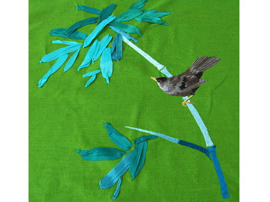
I want to base this unit of work loosely around the jungle book it has always been a fond childhood faviourte of mine. I want my work to reflect the jungle theme all the foliage and greenery and the camouflaged that it offers. My work has tended to be very pattern based in the past so I want to play on this fact and use it my advantage combining this with perhaps digital printing.  Collage and layering are important to me and something I want to do in this unit as well as I often find myself being drawn too appliqué using bonda web so I want to keep that I mind and again use it to my advantage.
How does the intended work/project relate to previous work?

All of my work has a mixture of hand and machine embroidery and this is a theme that I wish to carry through to this unit I feel as if it’s becoming my recognisable trate within my work. In my previous assignment it had a very natural feel to it and I really enjoyed it so I wanted to carry on this natural free flowing feel through to this unit as I knew It already interested me so It is a good place to start for this brief. I always create my work with the intention that It will be used within interior design this is a theme I will carry on through as I want to develop these ideas and look into more where within interior design would this unit of work lie. It relates to a lot of my previous work as well in a way where I start with a very lose inital idea “the jungle book” but I simply use that as a starting point and then I try and let me work flow freely without restricting myself too much.
   

  We were then asked to pick a Live project to be doing running along side your own initiated brief. I chose embroidering engineering which means I will be working towards creating a sample book for rolls royce for the interior of some of their bespoke cars. I aim to work from the same sketch book/books of drawings for both assignments and then to direct them off in different directions when it come to sampling etc.


Sunday, 23 November 2014

Evaluation.

When looking back at where my work started to how my final samples came out you can hardly see a relationship but when I look back through my work as whole I can see a strong path of where my work has gone. At the beginning I felt I didn't know what way I was going which did panic me. But what it allowed me to do was have a back log of images to work from when trying to create a concept. I didn't restrict my self with what I was drawing the way I was drawing and the media I was using, I allowed my self to be as free as I could. I went to several archive visit's which I also did many drawings from the photos that's I took there. From the drawings I then went on to develop those further I became stuck for new ways to create images so I began photocopying some of my old drawings and using the photo copies to create paper to collage with. It was through this I really found my feet and went full steam ahead into my work. I soon found myself always relating back to key images that I did from the beginning which is where I soon found my concept for this work. I wanted to take on the idea of old traditional patterns like the works of William Morris for instant and create a new modernized version with brighter colours and a more abstract design. I thought about where I could see my work going and what it could be for because my main inspiration came from William Morris I wanted to look at the idea it being for interior design. near the end of my project I created some images of what in interior design it could be for, I created a couple sample that I would want to have as a trimming of a lamp shade and i think that this is where I could see my work going as a collection of bespoke lampshades. I don't think my work would appeal to everyone but I could see it sitting nicely in a modern shabby chic sort of home with lots of nick nacks and trinkets. I think the old hand made feel would appeal to them and the vintage with a twist designs. I pushed myself within this project to try out things I hadn't done before like learning the ethos and using the embellish I combined the new techniques I learned with ones I have always used like hand and machine embroidery. When sampling I had a few things that I felt didn't quite work my first embelished sample I didn't like it had thick black outlines and I felt it looked basic but I learned from this and went on to just using the embellisher to create backgrounds for other samples. If I had the chance I would have loved to have taken this further and created some lampshade using the samples I am proud of the work that I have developed through out this whole process.


Transforming drawings to samples.

Looking at my drawings as a whole i realized I felt my strengths were in my collages and I needed to be able to transfer this into my samples. I didn't want my samples to be completely alike my drawings I want to be able to just carry on with my thought process through samples as well as my drawings so that it all flowed continuously. I don't want to see a stop point, with this in mind I picked out the key features that I wanted to carry out through out my work 1. colour pallete 2. patterns 3. layering. These are the features that links my work together but I don't want it all to look the same I want to always be creating something new with different ideas. I think the two images below show what it is that I'm trying to explain.


Both these samples share something else in common I'm not happy with either of these samples. They both have very harsh lines on them with the pink and the black. The black looks like an outline which I dis like. But I also I want them to look more defined than these they're to raw and have a rushed feel.  

Thursday, 20 November 2014

Taking my work further .

I often struggle with my drawings to come up with new ideas but I came up with the idea in this project when I got stuck I would go back through my work look at what I liked and develop on from that. From doing this I kept coming up with more and more interesting and even different ways too draw. Sometimes it would lead to a dead end but that's okay as well it just means I feel I have either taken it as far as I can or I simply just don't like the way its going. 


As you can see here I just kept working on it more and more then taking it into a sampled piece. 

Wednesday, 19 November 2014

Concept.

After visiting several archives and creating several drawings I am beginning to see where I want my work to go. I created drawings from the things that I saw at the archives I always drawn to vivid patterns, floral items and baroque (esk) styles. I then wanted to be able to combine all these factors and create my own style so I began creating collages from the drawings that I had done. I wanted to have a very layered feeling to my work with depth. I wanted my work to have all these vintage patterns that you often see with in the textile industry but add a modern twist too them by combining them all together. I took inspiration from a lot of old patterns from former student at MMU which I found in the library special collections and from artists such as William Morris. I want to take the idea of old traditional patterns and bring them into this day and age to make them modern.


Inspiration ( William Morris )

After visiting a few of the archives I really took to the work of William Morris with his floral prints and very particular style. His work links in well with the work that I produced over the summer as with out me even knowing a lot of my work was very organic with a strong influence from nature and wildlife etc. The special collections archive in the MMU library had a collection of wallpaper samples by William Morris that he would have used going door to door showing people his work and selling roles of his bespoke wallpapers. I find his work very visually pleasing I wanted to take on the fact that its very representative of what it is rather than being abstract which is similar in the way in which I work. On the other hand his work is very dated with the colours used and even the designs I wanted to his work as a strong inspiration for my own but bringing it into the present day. 


Tuesday, 18 November 2014

Fine cell work.

Fine Cell work. 
Fine cell work is a company set up to give in mates within prison the opportunity to learn a skill and to master that skill. Lady Anne who set up the organisation thought that needle point would be a good skill for the women in prisons to learn as she was always told by her mother in law that needle work had a very therapeutic quality and that was something that she wanted to pass on. Fine cell work allows the women to create bespoke pieces and for them to earn money from them I found their work through looking up luxury home items it was mainly the cushions that caught my attention. A lot of the designs are ones from very well known textile and interior designers what I like about it is knowing the fact that hand embroidery isn't a dying craft. Now we have all these machines that we programme to do our work for us, but I don't get quite the same satisfaction from it as when I do my hand embroidery. It was Fine cell work that reminded me of this and although I'm glad I know how to use machines like the ethos I want to go back to what I know and what I enjoy so I can master it as well. I have picked out the designs below as I thought the colours and the designs I think relate to the work that I'm doing right now.

   Nc127-bl_john_stefanidis_1_web_product_detail
Ec039_shells_stars_web_product_detail

Friday, 7 November 2014

Learning new things.

I made sure that I was pushing myself to take risks and learn skills that I hadn't used before the first thing that I learnt was using the ethos machine. You out designs into a special computer you scan images in and copy around them the machine is limited to the stitches that it can do it can only do three stitches a satin stitch, running stitch and fill stitch. I was able to stitch out two designs the first one was more of a practice one rather than a full design but my second one came out very well and was very pleased with the way it came out. 


Another new methood which I learned was to use the embelisher a very simple machine which simply pulls at the threads of the fabrics you can deconstruct and make material look work and you felt two pieces together. Below is a image where it worked really well I embelished a small section to create another surface to create a collage look. 


Thursday, 6 November 2014

Begining to sample


My first sample that I did by hand looking at one of my large collage drawings I looked at the brush strokes mainly that I had used. The thickness of the black outline and then the different tones of colour in the brush strokes within the drawing. Although I feel its a very simple sample just using hand embroidery and some simple applique I really like it. But I can see where I can take this sample further.


The next sample that I did I looked at a different drawing and observed that different pencil marks that I had made zooming in onto a specific area and just observing a little area. I created the second one using machine and hand techniques. After I had finished this one the zig zag cross hatch could have been done with some wadding underneath and then it can quilt it and add some texture to it. I want to parts of these and use them on other samples in the future also I have brought in the bright pink colour that I had planned to so that's something i need to think about in the future,  


Developing Drawings.

I started to look at my drawings and think where I could take them next I began to photo copy some of my drawings and turn then into collages by layering them on top of one another and then working from that. When I went to photo copy them something strange happened when i copied the drawings that I had done using goache paint they changed colour. 


The original image that I painted was all blue and I left the the design so I was painting the actual background but when I photo copied it I came out bright pink! First of all I thought It was vile but i decided that I was going to use it in my work because I have to pay for my photo copies. I was surprised how much I liked it when I started to work with it.  I call things like this happy mistakes, what I liked about this as well is it was something that I had no control over it just happened and for a good reason. 


I combined two studies that I did of William Morris's wallpaper from the special collection archive I used the same colour that I used for the background on the original drawing of the one that turned pink. I really want to make more collages like this and develop my work further perhaps bringing even more than two images into one drawing. This drawing is very relevant as it's what I'm going to base the reset of my drawings on this colour pallet. I really like contrast of the blue on the pink. 


Inspiration / context

I came across the work of Rachel Reynold through searching online other interior textile artists I hadn't thought of where my work was heading up until this point. But recently I have found myself looking into interior design more and more I'm not entirely sure just yet where my work would fall within this area but consciously researching interior textile artist. I can see my work making a very bold impact within someones home. Through this research I came across the work of Rachel Reynold online shes a print specialist and combines her illustrate drawings into her work. She produces fabrics , wallpapers and light shades I really like her work it's something that I would defiantly want in my own home, It's really inspired me more to look more into where my work for this assignment could be used in interior design. 

'Coins' Light Shade Large Drum

'Branch' Light Shades

Although my work isn't print based its the actual visual appearance of her work that caught my eye its very abstract combined with very vivid prints. The seconde image reminds me of deformed tree brachnes reaching around the light shade. These two images have given me the idea that I can turn some of my larger drawings into smaller repetitive patterns that I can then over lay on top with other images.  

Saturday, 25 October 2014

Archive drawing studies

Through out visiting the archives I was coming back and doing drawings from the photos that I took while I was there. I tend to zoom in on a specific area and draw small sections of something. I have tried to create drawings using a variety of media including pencil, fine liners, goache paint and inks. 

(Previous students work, embroidery study)

(1950's men shirt study- Rochdale Archive)

(printed tile study - Barcelona tile museum) 

I have selected a few drawings that I have started off with my drawing work, I want to carry creating drawings from the archive visits and from other sources such as book's. I am also going to start developing the drawings that I already have picking out aspect that I really find interesting or like. For instance In the last image It's the pattern that really works for me and I can see my self taking this forward bring it into other drawings maybe changing the pattern round or turning into into a collage of some sort. 


Thursday, 23 October 2014

Inspiration ( Karen Nicole )


  I came across the work of Karen Nicole after looking through work of textile artists on pintrest. Shes a embroidery and mixed media textile artist working within a range of fields including art, fashion and interiors. Her interior work its what first caught my eye as parts of it reminded me of William Morris's own work. I'm trying hard to work with bright colour for this assignment and all of her work is very bold and vibrant.


The top image gives me an idea of using the free hand foot to create some samples in a similar way. I also like the way she has something very representative ( the bird ) on top of something quite abstract the bird looks very 3D and the background is very 2D. 


The image below I think links in different aspects of my own work the colour and the movement within the image. Its given me ideas of how I can transform some of my drawings into samples. It reminds me of something you would see underwater or like a bark of wood. I'm really interested to know how she has created the lines going through the work, It looks to me like its been bunched up and then sewn together. The colours in this picece of work especially links in with my work as a lot of my drawings are just using blue tones with splashes of bright colour. It's given me an idea of how I can bring the different tones into my sample work with out using thick blasts of colour, it reminds me of when you make a brush stroke with paint on and you get the different tones coming through. I've put a image of one of my drawings to show the similarities between the two. 


Friday, 17 October 2014

Barcelona tile museum.

I visited Barcelona over the summer and as well as all of the obvious main attractions like the gaudi park I visited a tile museum. I didn't think I would find it all that interesting but when I looked back through my pictures I did some drawings from them. 


 After that I was hooked on the patterns from them and they really inspired a main part of my work all of my baroque swirls and patterns come from the photos that I took while out there.

Wednesday, 8 October 2014

Rochdale Archive

Another archive trip that we went to  Rochdale. It was a strange archive within 3 very large storage units but when you go inside it like being in a mini museum. We had a quick tour around the facility and then were left along with some of the objects to get a good look to make drawings take photos and get down some notes about individual pieces.  I wasn't particularly struck by anything with inspiration but it was interesting to see what they had in there. I did enjoy looking at the collection of garments that they had in there. There was one garment that did catch my eye though it was a mens shirt from the 50's with a very vibrant orange print. 


I think its the graphic black lines of the pattern that caught my eye I can see myself taking ideas from this and working it into my own work. I have used a similar technique within my own work from the summer brief, as you can see below. I used inks to create this image and after looking at the 50's style shirt I want to work in this way more using thick black graphic lines and loosely adding splashes of colour. 


Thursday, 2 October 2014

Special Collections

We have been given the chance to visit different archives to get inspiration from old works of textile as well as general pieces of art work. The first archive that I visited was the special collections in within the university's library. I was lucky enough to look through the pieces on my own as I missed the first visit with the group. The work which I really liked was a collection of wallpaper samples by William Morris. I've heard of his work before of course but I didn't realize the variety of patterns that he created. 


Other work that caught my eye from the same archive was a collection of paintings by a former pupil from the university as part of there work. I've realized that I'm drawn to very floral looking patterns and prints. Although the work that interested me from this archive isn't actual textile work its self I'm very interested into how I can translate first into my own drawings and then potentially into my embroidery work.   


Monday, 1 September 2014

Summer work part 2.

Over the summer I really began to think about where I see my work going and the more I think about the more confused I get. I can't say for certain that I still know exactly where I want my work to go but I feel more confident about which direction I feel it going in right now. I came across a company set up two talented sisters who master in embroidery they create bespoke pieces such as fabrics and furnishings for the home. I came across their work when I was trailing through the internet looking for artists and designers that I hadn't heard of before for inspiration. The thing that really caught my attention is the fact that they specialized in embroidery as the majority of textile designers within interior design mainly specialize in print.


Through out the whole of summer I was always on the look out for things that inspired me to  draw whether it be something in a gallery or on the street on just in my home. I always found myself been drawn back to natural things perhaps flowers or animals or the environment I just seemed to always be drawn to it.


Saturday, 2 August 2014

Everything I experience influences Everything I do.

I went to a exhibition called GIG by Phyllida Barlow at the Hauser & Wirth in Somerset, when first entering the gallery where her work was displayed I was met by a the great material poms poms. It was the colour that and use of different materials that first caught my attention and it was the thought of how these pom poms used up the negative space within the gallery. I like the fact how they are suspended in the air free hanging so you actual interact with the art having to walk around them.


The second image is from the Arnol Fini gallery In Bristol the images below how maps of the city representing different things for instants one of the showed the different populations of different political parties within the the city. At first looking at one on its own I just didn't find it interesting but looking at the maps as whole together really inspried me with the summer brief because it reminded me that you can look at anything and gain inspiration from anything. 


I also visited several galleries while in Barcelona a textile and costume museum where they had clothing from all different periods in time. You can really see how fashion has changed through out the ages, and the material and the way in which it is used. I also visited a tile museum which surprised me , I didn't think I would find it interesting at all but it really caught my eye all the different patterns and it was the colour that really inspired me I took a lot of photos to hopefully work from at a later date. I know it doesn't link with textiles immediately but its the visual attraction of the tiles especially the Braquesk patterned ones that I really like. I could see some of the patterns in peoples home today and used for prints within the fashion industry. 


Sunday, 11 May 2014

Evaluation / Final Piece


 I can't lie that I was a little disheartened when I found out that we were creating a hot water bottle cover. But after taking on board the project and fully emerging myself in the topic I couldn't get enough. I kept my final piece simple in the design of the hot water bottle and went a little crazy on the design. What was very useful was the group crits that we continuously had it allowed the whole of our class to give constructive criticism to help develop our work further. It was in these sessions that I learned I hadn't developed a strong enough colour pallet half way through our project and quickly made changes to amend that. I really enjoyed Visiting the exhibitions and archives but for me my main source of inspiration came from learning all about "kantha" and look at images from protests from PETA.


 My favorite aspect has got to be the back at first I wanted to have them just joined as the backing but it wouldn't have been practical, you would be able to see the actual hot water bottle. I think the design is busy and fun which is what fairground atmospheres are like. I would say that it would appeal to women rather than men which wasn't what I first intended. I was hoping that it would appeal to both genders but now looking at the colour scheme i feel it is much more feminine. Id hope it would appeal to all ages as in my mind children would find it attractive and cosey and I think older generation can appreciate all of the hand work that has gone into it as well as the imagery on the front. If I could I change it I would have the front as the back and the back as the front as I feel the back is the focal point. I'd also change the material used I would have chosen something with more strech. Although I used 100% cotton because it's the best for tie dye and doesn't lose its shape or let the colour run. Overall I am pleased with My final piece and I know that I will defiantly be using it!